The Internet is rich with inspirations for interior design. Do you want a minimalist Japanese-style home? What about an industrial design theme? A quick search on Google would lead you to links for design themes, interior design trends, and everything else you need to know about homes. But browsing gorgeous photos is different from doing the designing itself. This is why we have professional interior designers who spend years mastering their field.
Don’t have the budget to hire a professional for your home? Don’t worry. You can learn, and apply, basic principles in interior design for your condo design ideas. Give your condo a fresh look with these five interior design do’s and don’ts.
1. Do choose the right colors for each room

Photo courtesy of Scott Webb via Pexels
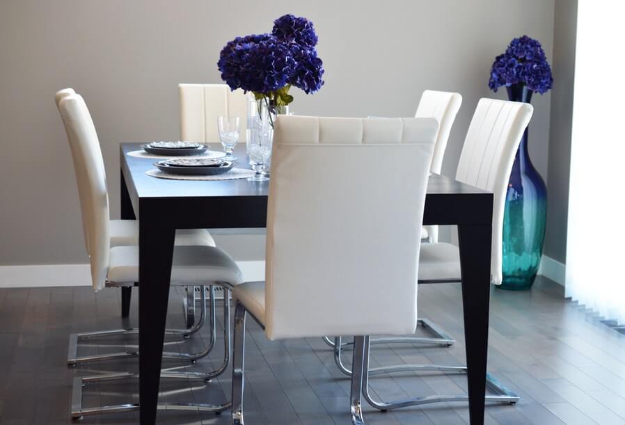
In designing a home, size doesn’t really matter. Current decorating trends are focused on space-saving techniques that make tight homes appear bigger. Interior designers strongly recommend choosing the right color palettes, furniture pieces, and décor.
What works for a small space, dark or light colors? This is still up for debate. Some say that painting your bedroom walls with navy blue can make it look cramped while others argue that a deep shade gives exudes a warm vibe. Designer Darryl Carter says that your choice of colors should match the room you’re painting. “If it’s a library or personal space, dark color can create a wonderfully inviting sanctuary,” he tells Country Living. For hallways, you can never go wrong with neutrals that make the area light and airy. Add a large mirror to create an illusion of more space.
2. Don’t match everything but do have cohesion

Photo courtesy of Tim Gouw via Pexels
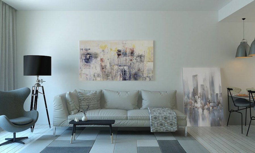
You can’t blame yourself for trying to imitate the stunning designs on interior catalogues and Pinterest. But remember that these designs are meant to sell condo units and furniture pieces. Create a liveable home with a cohesive design. You can use sample interiors as a guide in choosing suitable colors and materials for the interior style of your choice.
Don’t get too ecstatic when mixing shades. A red living room, orange kitchen, and blue bedroom may seem unique, but this design lacks consistency and cohesion. Do go for three hues only. Designer Butter Wakefield used green, black, and white in her small villa to “open up” space. “If you do opt for multiple wall colors, keep moldings and trim the same color,” advises Better Homes & Gardens.
You can also opt for different shades of one color. For a relaxing green theme, you can have sage, lime, and seaweed. You can also try a combination of teal, baby blue, and sapphire.
3. Don’t decorate your home with tiny furniture pieces

Photo courtesy of Pixabay via Pexels
One of the essential small space living ideas you should know involve furniture pieces. Buying tiny tables and chairs can make your home look smaller. When it comes to choosing for the right pieces, New York-based furniture company Raymour & Flanigan highlights three components: styles, placement, and functionality.
Do opt for multifunctional furniture that maximize space and avoid visual clutter. You can visit shops for slide-out beds, sofa beds, and extendable tables. Mix in tall pieces such as bookcases.
Don’t display small pieces of décor all-around your home. A collection of tiny plant pots can make your space appear cluttered. If you want an indoor plant, go for a large pot of spider plant. You can use it as an accent piece that sets the mood in the room. Other accent pieces you can incorporate include a charming Duchess chair, a china cabinet or a large painting.
4. Do go for classics

Photo courtesy of Pexels via Pixabay
The problem with riding a fad is that trends come and go. Enormous and elaborate chandeliers were “the thing” a decade ago, but people wouldn’t splurge on such pieces anymore. Do go for the classics instead of trends. This can save you money and effort. In some instances, renovations can result in an increase in home insurance premiums.
You don’t have to repaint your walls every time Pantone announces its Color of the Year. You can go for a neutral shade, which will serve as a canvas, then feel free to design the room with the color theme of your choice. You can mount curtains in pastel shades for your French Country design or add an accent chair in vibrant orange for a 70s retro vibe.
Custom curtains with elaborate designs are just costly and easily go out of style. Opt for simple yet chic drapes. Choosing classics especially applies to your bathroom tiles. Avoid outlandish tiles that may be fashionable today but tacky tomorrow.
5. Don’t go overboard; do open up your storage

Photo courtesy of terimakasih0 via Pixabay
A chaise lounge chair may seem inviting but does it suit your interior design style? In micro homes, the simpler, the better. Elaborate drapes can make your living room look packed. Simple window treatments provide a clean and airy look and allow natural lighting. Consider mounting blinds or sheer curtains that control light and ensures your privacy.
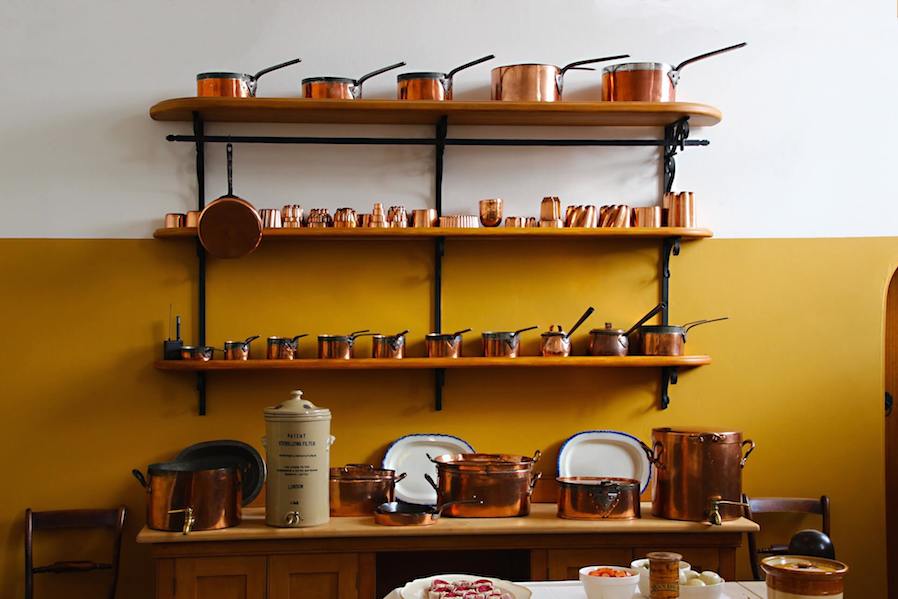
Open shelving can make a room feel larger especially in kitchens. Christina Hibbs, blogger and owner of Christina’s Adventures, ripped out the upper cabinets in her small kitchen and opted for open shelving. “It lets so much more light in from our windows, which helps make the space feel so much bigger,” she tells Good Housekeeping. “Open shelves invite visitors to feel at home and help themselves to whatever they need. They don’t have to ask where things are, or go rummaging through cabinets because it’s all in plain view,” adds Jaime Scott of Caught in Grace.
Open shelving allows you to display your beautiful chinas and create a serene atmosphere in your cooking area. However, avoid creating visual clutter by keeping items organized.
You are lucky to live in an era where information is readily available. You can educate yourself on interior design styles, including their history and elements. You may explore materials that can fit your interiors and budget. Interior design trends are just a click away. However, this doesn’t mean that you’re free from making expensive mistakes. Know the right colors, proper furniture, and décor that suit tight spaces. Don’t just throw in hues and items. Create a liveable place with a cohesive design for a better condo living.


