20 Ways Maximize Condo Space and Get The Most Out Of Your Unit
The cost of real estate properties in the Philippines is generally based on two things: location and size. For properties in prime locations, it is sometimes necessary to downsize or adjust the condo layout in order to achieve a cost-effective investment. Such is the case for a condominium.
A typical condo unit in the Philippines comes in different condo sizes and structures that are expectedly smaller than single detached or townhouses. But this doesn’t mean that condo dwellers need to sacrifice the comfort on their home. Experts share vibrant small condo design ideas that can maximize the space and make it visually bigger.
How to Maximize Condo Space from a Small Unit
- Double purpose everything
- Keep your condo unit tidy
- Keep them on the side
- Brighter is bigger
- The right blend
- Monochromatic effect
- Push it backwards
- Looking through the glass
- Open up the space
- Let the mirrors do the trick
- One is greater than two
- Keep it continuous
- Accents should make, not break
- Plains and prints
- Keep it simple
- Balance the scale
- Unload the bulk
- Think vertical
- Create an illusion of a high ceiling
- Draw the lines
1. Double purpose
There are many ways to create an illusion of space. But before resorting to these cheats, think first of ways on how you can actually make space. Double-purpose furniture, such as sofa beds, allow you to accommodate guests for daytime chit-chat and nighttime sleep over, without wasting space on added furniture. Coffee or center tables that are convertible to chairs also provide your much needed space.
2. Keep them tidy
Small things, when put together, can be potentially big. These refer to your usual clutters – small personal belongings, cleaning items, tiny figurines and decors – that usually eat up your tabletop and floor space.
When creating for your condo design idea, look around for potential storage spaces. A bed, couch, coffee table or stool can be custom-made to have hidden drawers or compartments. The space under the staircase may be used for shelves and cabinets to hide bigger items such vacuum cleaner and baby stroller.
3. Keep them on the side
Sometimes, more than the usual space is needed – such as for exercise, social gatherings and other activities. So be ready with furniture that can be folded up and stacked, or furniture on wheels that can be pushed to the side to provide for the needed space.
4. Brighter is bigger
Perhaps the most basic step in creating a grand optical illusion is to maximize light. Proper lighting combines the right use of natural and artificial lights. Use lamps to bounce off light towards the ceiling, making it appear higher. Using corner spotlights, instead of a center chandelier, provides added brightness and more visual space. For spotlights, consider using LED bulbs for an energy-efficient home design.
5. The right blend
Light and cool colors make the walls more reflective, thus maximizing the effect of natural light. It makes the space feel open, creating a warm and inviting feeling. Neutral-colored walls can be complemented with bright colors by adding accessories such as blankets, pillows and vases. Choosing the right color combination can affect the mood in a room, from relaxing to energetic.
6. Monochromatic effect
Another option to dominantly light-colored room is to use monochromatic colors. This means sticking to one color and using it in different shades, from light to dark, creating a large, unified look. Dark colors for furniture and rugs may demand less cleaning for better sustainability in your condo.
7. Push it backwards
If earth tone is your choice to give your walls a natural look, you may paint your moldings with a lighter color so the wall appears further back.
8. Looking through
Various online articles often share about tips on maximizing space. Putting these ideas together essentially points out one thing – allow people to look through. This means putting on light-colored, thin draperies to allow guests to look through your windows, creating an impression of the outside view as an extension of your home.
9. Open up
Open shelves also provide the looking through effect that closed cabinets cannot offer. But when using open shelves, don’t fill them up else it defeats the illusion of air and space.
10. Let the mirrors do the trick
What’s better than visually pushing back the walls? Make them disappear! Mirrors never fail to create this illusion. Use them in living room and hallways.
11. One is greater than two
The whole is greater than the sum of its parts. If this was true, then your design should lead the eyes in viewing the condo in its entirety, rather than its individual parts. Whenever possible, remove walls and doors that separate adjacent spaces for added sense of space.
12. Keep it continuous
Use the same color and flooring to join together the adjacent spaces, or at least, stay in the same color family. Consider also keeping the draperies in the same color as your walls.
13. Accents should make, not break
Stones or wall paper on certain portions can work well in breaking the monotony in the walls. But be watchful that they stick to their purpose of providing accents, rather than breaking the room into separate portions.
14. Plains and prints
Using plain color fabrics on big elements such as draperies, furniture and rugs makes them unify with the room, thus creating an expanded effect. If printed fabric is your choice, use the ones with smaller, fine prints.
15. Keep it simple
In keeping further the unified effect, avoid unnecessary details such as intricate moldings or raffles in curtains and furniture.
16. Balance the scale
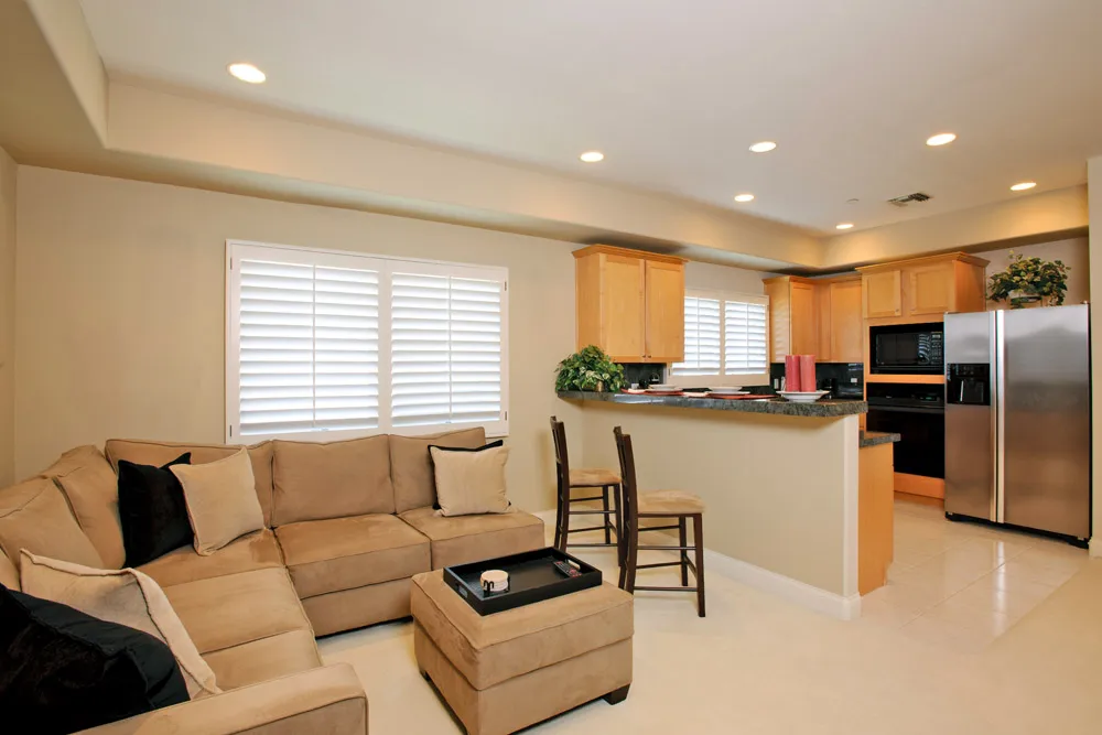
Here’s another proof that whole is greater that its parts. People think that large furniture belongs only to a big condo. Not so. Sometimes, a few large bold pieces can work better than several small pieces. For instance, single large corner furniture can work better in small condo sizes, rather than a 2 to 3-piece sofa set. Keep the main furnishings in proportion with the room.
17. Unload the bulk
Avoid bulky-looking furniture, such as beds with thick headboards or sofa with wide armrests. For maximum effect, use sofas and armchairs with raised legs to provide an illusion of light and space.
18. Think vertical
Creating a visually larger space does not only work horizontally, but also vertically. A floor-to-ceiling shelf visually pushes the ceiling upward. The same trick works by hanging the curtain from the ceiling down to the floor, instead of covering the window area only.
19. Up, up and away
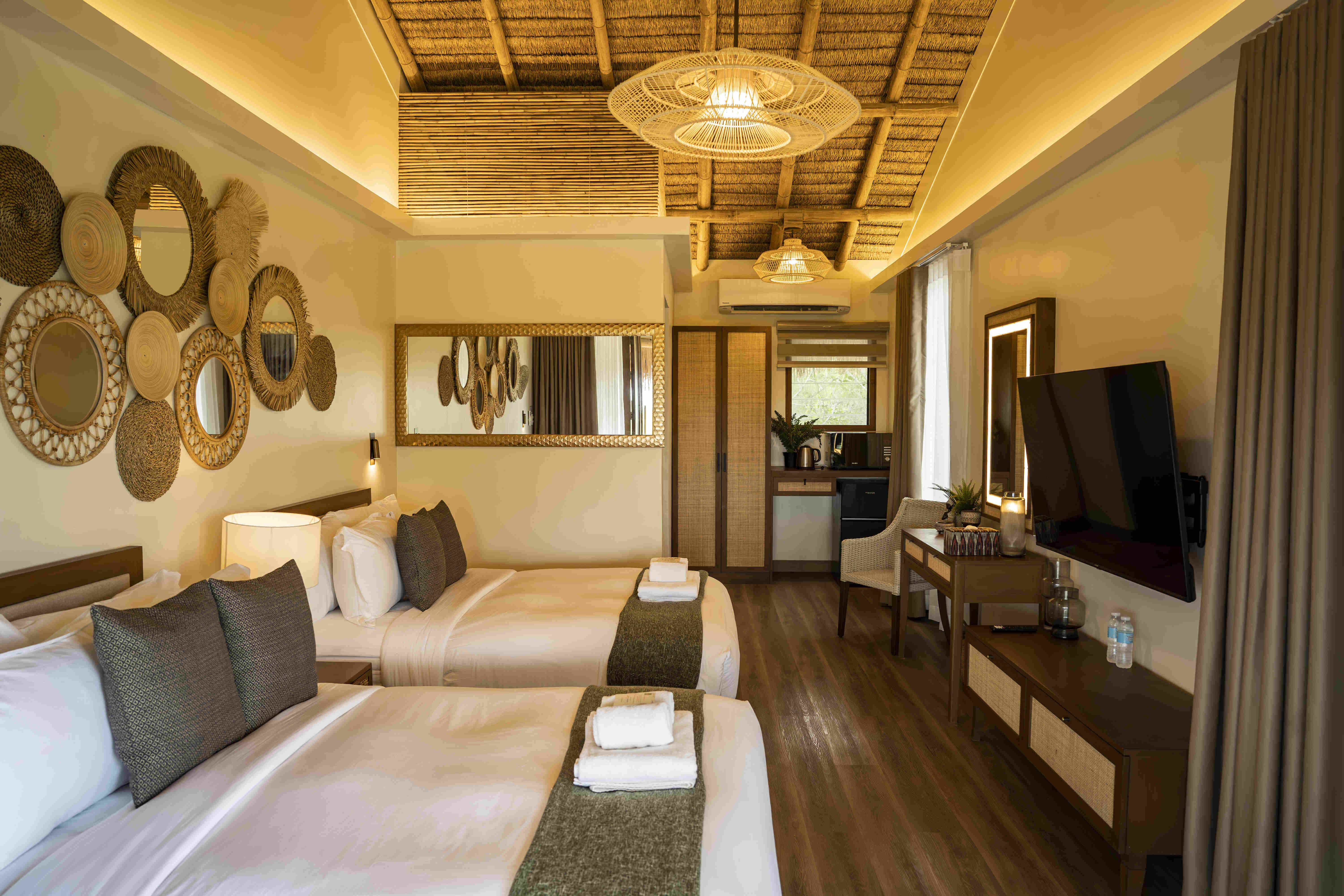
A high-ceiling effect can also be achieved by leading the eyes upward. You can do this by designing a drop ceiling, hanging overhead display shelves, or arranging your art pieces vertically.
20. Draw the lines
Horizontal and vertical lines can also visually stretch the room sideways and upwards. Using horizontal wall panels or vertical floor planks can produce these lines in a subtle way. But be careful not to go overboard on stripes that separate the walls or flooring into pieces.
Choosing to buy or rent a condo over a single detached home may mean settling for a smaller space. But weighing the cost of condo living over a house and lot may prove your decision to be wiser. After all, there are remedies to the size, but there may be no substitute to the convenience, easy-maintenance and home security that a condo can offer.


